Growth and Airway · Brand identity · Visual direction options

Three ways to dress the same identity.

The strategy, positioning, manifesto, tone of voice and the GA monogram are settled. What follows are three distinct visual systems (type, image direction and graphic language) built on that foundation. Colour is wide open: each route offers three palettes you can switch between live, and any palette can be rendered Monochrome (a single base hue plus tonal shades and neutrals, no second colour). Nothing here is pre-decided on colour.

Tip: click a palette to preview it across the panel; tick Monochrome to collapse it to one hue.

Fixed across all three routes

Mark

The GA monogram (interlocking G/A, flowing tail). Routes change the system around it, not the mark.

Positioning

A developmental framework: guiding craniofacial growth, airway and function over time.

Audiences

Children and adults, co-equal. In two-colour palettes the accents sit in parity; in Monochrome they read as two tones of one hue.

Voice

Explain, don't persuade. Measured, warm, never fear-based or cosmetic.

View home page design →
ROUTE 01

Editorial Clinic

A clinical paper that happens to be accessible. Type carries the weight; a single hand-drawn anatomical line illustration anchors each page. Warm, considered, literary.

Leans into → confidently authoritative, through editorial gravitas. "Clinical translation" rendered as a thoughtful publication.

Best when the brand wants to read as the most serious, evidence-led voice in the room. This is the route already prototyped across seven website screens. The lowest-risk, most-tested option.

Colour: pick a palette, then optionally go Monochrome

Two accents (children & adults) in parity, or two tones of one hue in Monochrome.

Typography

Children · Adults · Clinicians

Guiding healthy growth, breathing, and function over time.

Development is not correction

We look beyond teeth alone, considering how craniofacial growth, airway and oral function shape long-term health, at any age. The serif sets the editorial register; the sans keeps long-form reading comfortable.

HeadlinesNewsreader
Body & UIInter
Labels & eyebrowsIBM Plex Sans
The fixed monogram, shown in this route's palette. The mark is constant across all routes and palettes. Only the colour adapts.

Image direction

Editorial craniofacial line illustration

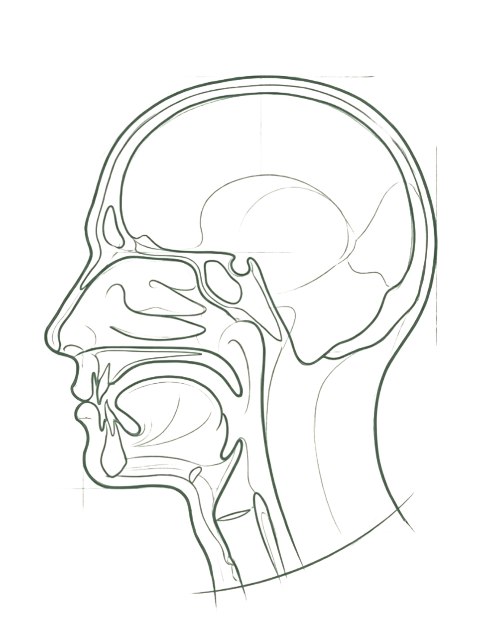
Editorial line illustration

19th-century scientific-engraving feel: single hairline weight, hand-drawn, ink on cream. One per page, as an anchor.

Single flowing line

An abstract breath/growth curve where a full illustration isn't warranted. Quiet, never decorative.

documentary photography of consultation: hands, attention, faces optional

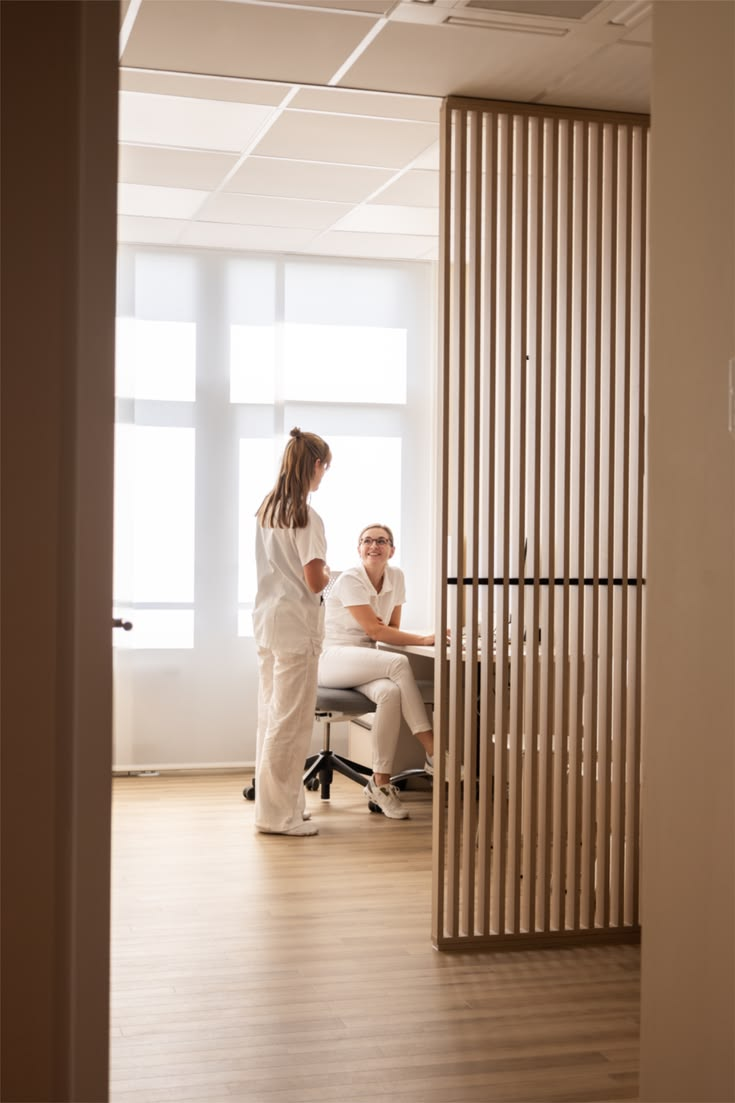
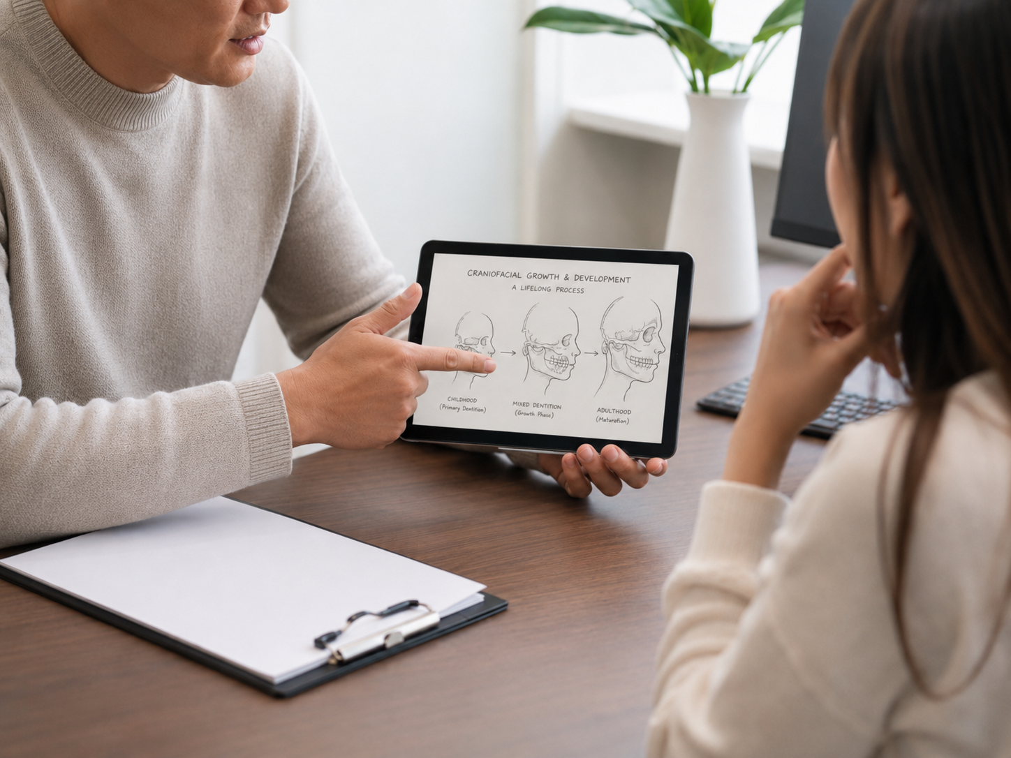
Warm documentary photography

People in conversation, natural light, no clinical-blue scrubs. Supporting, not hero.

Still avoids: clinical-blue / 3D anatomy, X-rays, before/after grids, stock "happy family", wellness clichés, fear imagery.

Graphic language

Development unfolds over years, not appointments, and the timing of care matters as much as the care itself.

Drop caps & long-form

Editorial blocks open with an accent drop cap. The page reads like an article.

The approach

Hairline dividers & eyebrows

Structure comes from rules and small-caps labels, not boxes or shadows.

“Understanding why a problem exists matters as much as treating it.”

Pull quotes

Key ideas lifted into large serif quotations, set off by hairline rules. The editorial voice made visible.

Applied: home page

Children · Adults

Guiding healthy growth, breathing, and function over time.

Care understood as part of long-term development, not isolated correction. We help families and adults understand how structure, airway and function connect.

Care for childrenCare for adults
Editorial craniofacial line illustration

The approach

Development is not correction. We look at how craniofacial growth, the airway and oral function develop together, and at the timing of care, before recommending anything. The page reads like a considered article, not a brochure.


“Understanding why a problem exists matters as much as treating it.”

Children

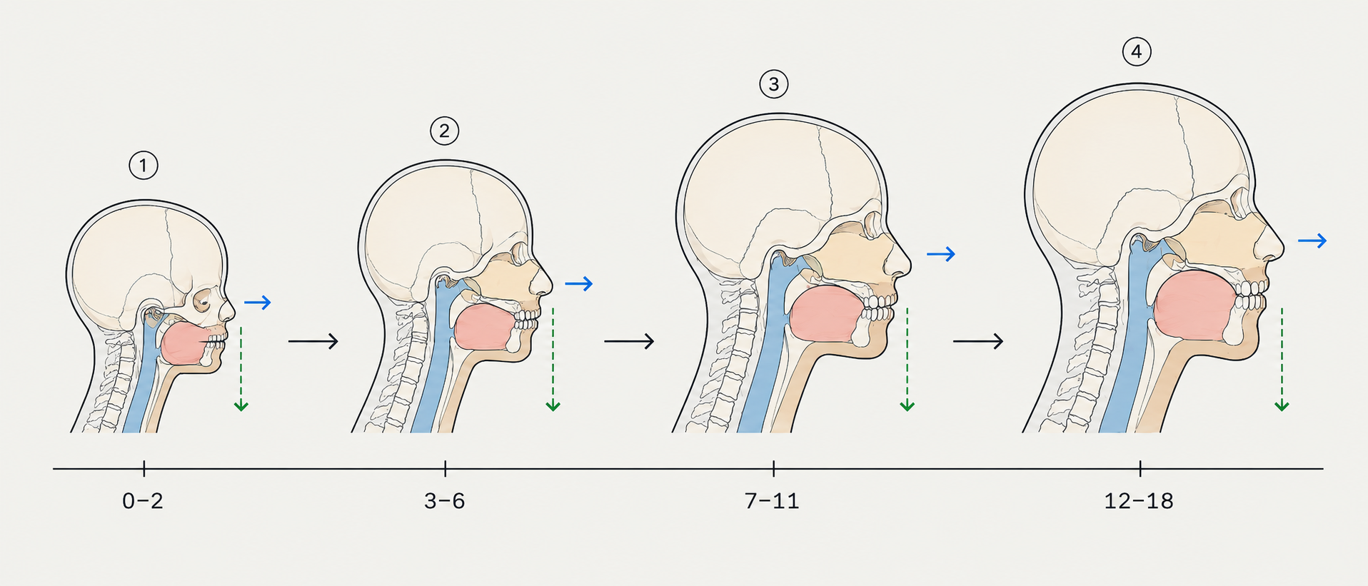
Intercepting early, before problems compound

Growth guidance, airway development and early orthodontics, timed to how a child is developing.

Adults

Resolving the cause, not the symptom

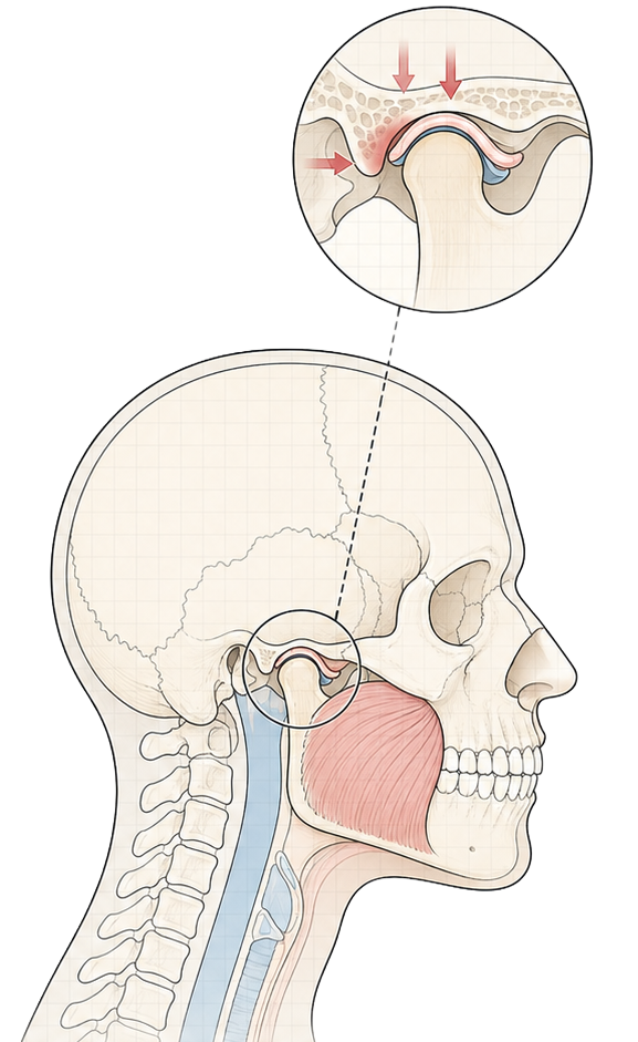
TMJ, bruxism, sleep and breathing, understood through the underlying structure and treated at the root.
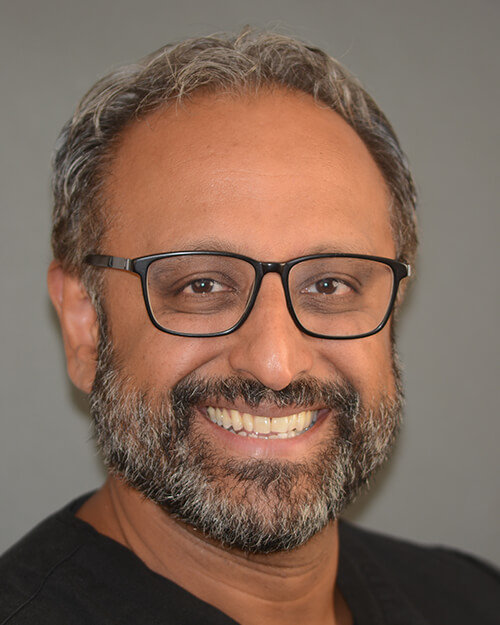
Dr Biju Krishnan

The principal

Dr Biju Krishnan

Founder of Growth and Airway. He works across orthodontics, airway and craniofacial development, helping children and adults understand how growth, breathing and function connect over time.

Practitioner showing a patient a hand-drawn craniofacial growth diagram on a tablet

On the page

Care explained, not sold

A single editorial illustration or quiet, duotone documentary photograph anchors the page. Generous space, long-form copy, and imagery that informs rather than persuades.

ROUTE 02

Calm Minimal

Soft, rounded and reassuring: the BP / Headspace register Biju referenced. Friendly geometric type, abstract organic shapes, generous air. Lowers the barrier for an anxious parent or a worn-down adult patient.

Leans into → calm and inclusive, reassuringly clear. Approachability as the route to trust.

Best when the priority is feeling unintimidating and human. Watch: must stay disciplined or it drifts toward "wellness app" and loses clinical authority. Guardrails matter most here.

Colour: pick a palette, then optionally go Monochrome

Brighter, friendlier pairs with a soft warmth accent, or one hue in tonal steps when Monochrome.

Typography

Children · Adults · Clinicians

Guiding healthy growth, breathing, and function over time.

Development is not correction

A single friendly geometric family carries the headlines; a rounded humanist sans keeps the reading soft and open. The feel is closer to a well-made app than a journal.

HeadlinesPoppins
Body & UINunito Sans
LabelsPoppins (tracked)
The fixed monogram, shown in this route's palette. The mark is constant across all routes and palettes. Only the colour adapts.

Image direction

Sculptural plaster relief

A breathing surface

Not shapes placed on the page but the canvas itself, gently swelling and settling. A soft, single-colour relief lit from one side, so it reads as the material breathing.

Line iconography

An elegant, single-weight icon set (Feather-style: thin strokes, rounded caps) in the brand colours, for services, navigation and wayfinding.

Warm candid clinic consultation

Soft-framed photography

Candid, warm photography always inside rounded frames or shapes, never hard rectangles.

Still avoids: clinical anatomy, fear imagery, cosmetic before/after, and here especially: zen stones, leaves, meditation poses (the wellness-cliché trap).

Graphic language

Big soft shapes

Tinted blobs and pills frame content. Generous radius everywhere; nothing sharp.

Care for children

Square buttons

Sharp-edged, confident colour fills. Architectural and considered, not soft or app-like.

ChildrenAdultsSleep

Soft tags & chips

Rounded pill tags in soft tints label services and audiences. Friendly wayfinding, never clinical.

Applied: home page

Guiding healthy growth, breathing, and function
over time.

Understanding how structure, airway and function connect, explained calmly, at any age. A gentler way into care.

Care for childrenCare for adults

Children

Care for children

Gentle, early guidance for growth, breathing and developing smiles.

GrowthAirwayInvisalign First

Adults

Care for adults

Relief for jaw pain, grinding, snoring and disrupted sleep.

TMJBruxismSleep
Dr Biju Krishnan

Your clinician

Dr Biju Krishnan

Founder of Growth and Airway. He works across orthodontics, airway and craniofacial development, helping children and adults understand how growth, breathing and function connect over time.

Warm candid consultation

On the page

A gentler first visit

Warm, candid photography in soft frames carries the human side, real moments of conversation and shared attention, never clinical stock.

ROUTE 03

Framework / Structural

The developmental framework made visible. A precise grotesque on a measured grid, diagrammatic motifs, growth-over-time as a recurring device. Authority through visible reasoning and structure.

Leans into → the lead brand idea itself: a developmental framework, authority by reasoning. The most distinctive and ownable route.

Best when differentiation matters most and the brand wants to look like a system, not a clinic. Watch: can tip cool/technical. The warm second accent and paper canvas keep it human.

Colour: pick a palette, then optionally go Monochrome

Deep base + warm second accent on neutral paper, or one hue plus graphite neutrals in Monochrome.

Typography

Children · Adults · Clinicians

Guiding healthy growth, breathing, and function over time.

Development is not correction

A structural grotesque sets the headlines with measured tension; Plex Sans keeps the body precise and legible; a mono carries labels, dimensions and data. The system reads as engineered, not decorated.

HeadlinesSpace Grotesk
Body & UIIBM Plex Sans
Labels & dataIBM Plex Mono
The fixed monogram, shown in this route's palette. The mark is constant across all routes and palettes. Only the colour adapts.

Image direction

Annotated anatomical TMJ section drawing

Technical section drawing

Craniofacial profile as a measured architectural section, annotated, dimensioned. Reasoning made visible, not a textbook scan.

Craniofacial development stages

Growth-over-time timelines

Development plotted on an axis: the framework's core idea as a literal, recurring graphic device.

Patient with orthodontic braces FIG. 05 · Consultation

Captioned figure photography

Photography treated as documented evidence: hairline frame, mono caption, figure number.

Still avoids: clinical-blue renders, X-rays, fear diagrams. The structural line work must stay editorial, never read as a medical scan.

Graphic language

Visible baseline grid

The grid is part of the design, not hidden. Content snaps to a clear modular structure.

Corner brackets & dimension marks

Bracketed frames and tick marks signal precision and measurement throughout.

AssessGuideReview

Modular blocks

Labelled modules carry real content, focus areas, stages, measures. Segmented and measured, never empty decoration.

Applied: home page

Children · Adults

Guiding healthy growth, breathing, and function over time.

A structured, evidence-aware framework, looking beyond teeth alone to how growth, breathing and function shape long-term health.

Care for childrenCare for adults
Annotated anatomical TMJ section drawing

FIG. 01 · Development over time

Craniofacial development over time

FIG. 02 · Children

Intercept early

Growth guidance and airway development, timed to a child's stage.

GrowthAirwayEruption

FIG. 03 · Adults

Treat the cause

TMJ, bruxism, sleep and breathing, resolved through structure.

TMJSleepFunction
Dr Biju Krishnan

FIG. 04 · Principal

Dr Biju Krishnan

Founder of Growth and Airway. He works across orthodontics, airway and craniofacial development, helping children and adults understand how growth, breathing and function connect over time.

Patient with orthodontic bracesFIG. 06 · Outcome

In practice

Evidence, not embellishment

Photography is treated as documented evidence: duotone, hairline-framed and captioned like a figure, so it informs rather than decorates.

Three routes at a glance

01 · Editorial Clinic02 · Calm Minimal03 · Framework
Feel Serious, literary, warm Soft, friendly, reassuring Precise, systematic, ownable
Type Newsreader · Inter · Plex Sans Poppins · Nunito Sans Space Grotesk · Plex Sans · Plex Mono
Image Engraving line illustration Breathing relief surface Technical section drawings
Graphic Drop caps, hairlines, monogram Soft blobs, pills, tints Visible grid, brackets, timelines
Palettes Forest & Rose · Petrol & Ochre · Garnet & Stone Terracotta & Honey · Plum & Amber · Rosehip & Moss Navy & Clay · Ink-Teal & Rust · Aubergine & Amber
Risk Lowest: already tested on 7 screens Drifts toward wellness app if undisciplined Can read cool/technical if accents pull back